Stand apart from clichés
Build a visual language with the attitude of riding culture without relying only on predictable motorcycle graphics and symbols.
ICOR GROUP · RIDING COMMUNITY
More than a riding group, ICOR is a community shaped by shared roads, meetups and experiences. We developed a visual direction that brings the energy of riding together with the connection that keeps its members moving as one.
A riding community is defined by more than motorcycles. It is the people who show up, the routes they share, the events they remember and the connections that form along the way.
ICOR needed a visual identity that could represent those different parts of the group with a consistent, recognisable presence. The work focused on building a brand language that feels at home in the riding world and can extend beyond a logo into community touchpoints and merchandise.
Capture the energy.
Keep the people at the centre.
Build a visual language with the attitude of riding culture without relying only on predictable motorcycle graphics and symbols.
The identity needed to stand for rides, events and the community itself — not just the machines or the act of riding.
Create a direction that remains legible and recognisable when applied to merchandise and member-facing touchpoints.
Bring the group together through one clear visual system — bold enough to carry the spirit of riding, flexible enough to represent the people and experiences around it.
A COMMUNITY, MADE RECOGNISABLE.
We leaned into a bold, high-contrast direction with a strong emblem-like presence. The aim was to make ICOR feel confident and memorable without losing the community-first spirit behind the name.
The identity direction was considered as a repeatable system rather than a single isolated logo, helping the group maintain a consistent visual presence across community communications and branded applications.
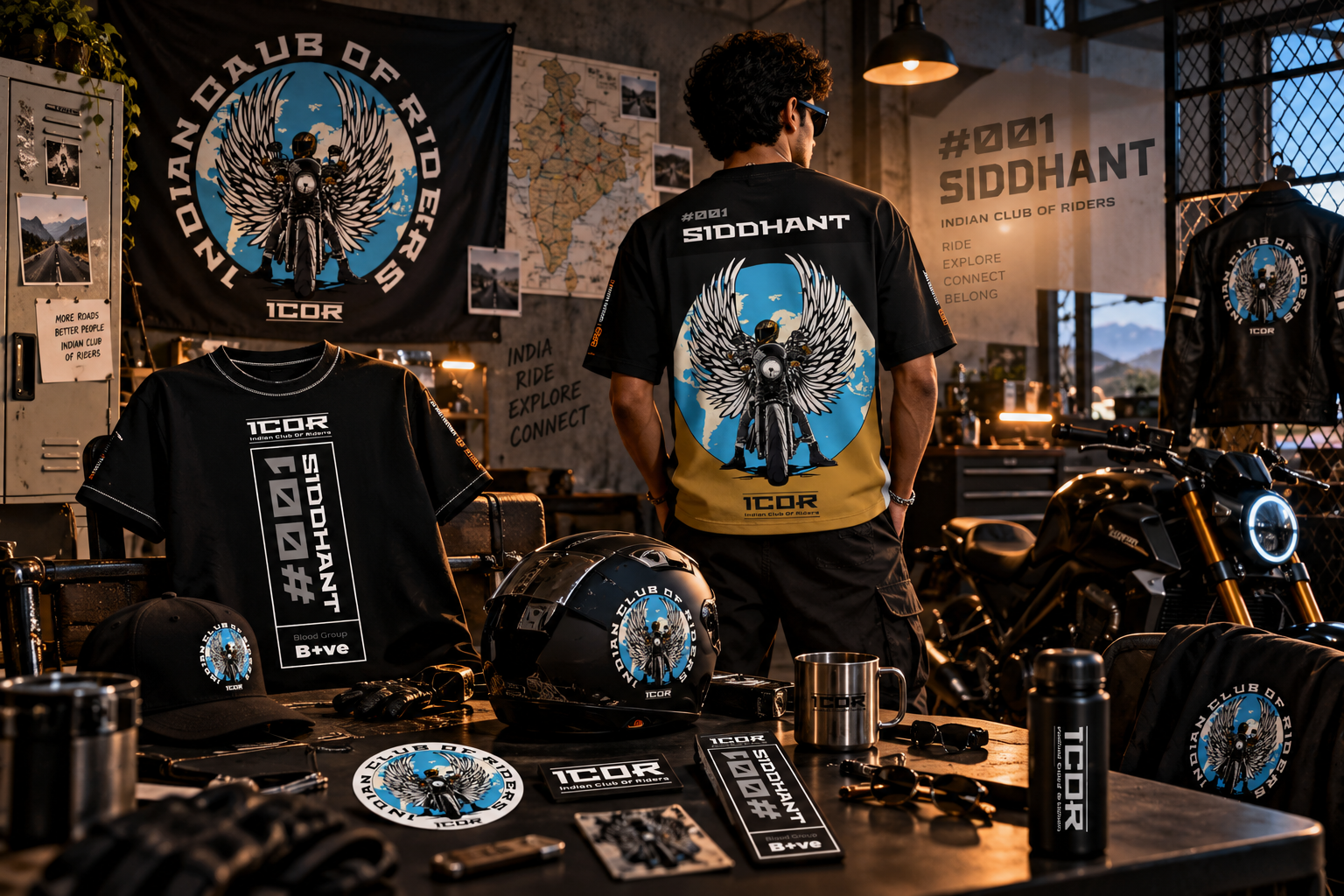
Merchandise gives members a tangible way to carry the identity. We extended the brand direction into gear concepts designed to feel connected to the group and its shared riding culture.
The brand story was framed around the group's three central pillars: the rides themselves, the events that bring people together, and the community that continues between them.
A visual language for
life around the ride.
Illustrative gear visual showing how the identity can move onto merchandise.
Three connected parts of the ICOR experience.
Conceptual CSS-built artwork for portfolio layout. Replace with approved ICOR identity files and real merchandise photography before publishing for the most authentic presentation.
From a group name
to a shared visual language.
Rides / events / members
Mark / visual system / gear
The identity connects the experiences that make ICOR a community. It creates a shared visual reference that can appear across group communications and merchandise, helping different moments feel like part of the same story.
A more cohesive identity
for a community in motion.
A consistent brand direction across community identity and merchandise concepts.
A bold visual direction rooted in riding culture.
A system designed to move beyond the primary mark.
Rides, events and members brought under one brand story.
This case study describes the design direction and deliverables, not measured business impact. No unverified adoption, sales or engagement figures are claimed.
A strong community identity should be felt on the road — and recognised beyond it.
Built around the ride.
Made for the people.
For ICOR Group, the work focused on expressing the riding community as more than a collection of rides. The identity direction and merchandise concepts bring the group's energy, events and sense of belonging into one coherent visual story.
Back to selected work↗BUILT WITH INTENT. MEASURED WITH PURPOSE.
A community-first identity designed to bring rides, events and member belonging under one recognisable visual language.
Directional targets for community and merchandise rollout—not member growth or event attendance results.
Connect the design system to real-world measurement: establish the baseline, instrument the journey, review performance monthly and optimise against the target.
Build something measurable ↗We're currently reworking our case studies to give you a deeper look at the thinking, process and results behind our projects.
Whether you're launching something new, levelling up an existing business or entering a new market — let's build something people remember.
Start a conversation